I had Snare & Tanner running on two different digital ocean’s droplets. I just wanted to see what juicy data I can get using this honeypot. How I deployed it is a different story and I’ll write a different blog post for that. In this post, I just wanted to share small code I wrote as well as some graphs I was able to generate using them.
Downloading data using Tanner API
Tanner doesn’t support any inbuilt export option(yet) but it has an API so I wrote a small python script to download data from my tanner API and store it in a JSON file.
Visualizing data
Ok, so now I had all the data from the tanner server in a file named tanner_9f7d7dd3-ac6b-468b-8cee-ce3e352eff6e.json. Then I used a library like pandas, matplotlib to generate some graphs. You can see the gist below that contains the code that I used to get some graphs. And before you scroll down just want to clear one thing, I am not an expert all this visualization with matplotlib and pandas(like @Ashish) so it’s possible that my method of cleaning the data, making data frames looks very odd to you. If you have any suggestions then please let me know.
Graphs
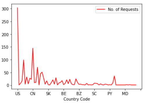
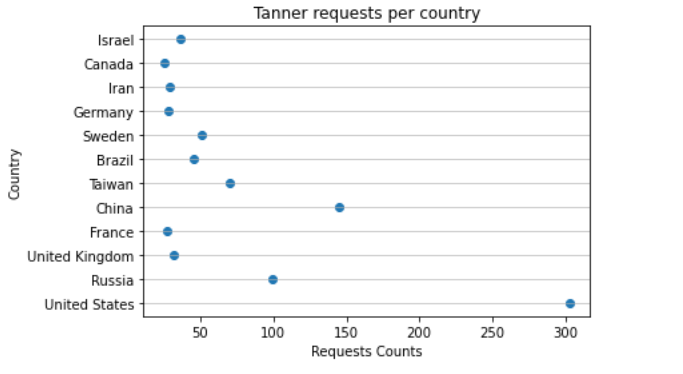
- Simple line graph showing number of requests made from various countries.
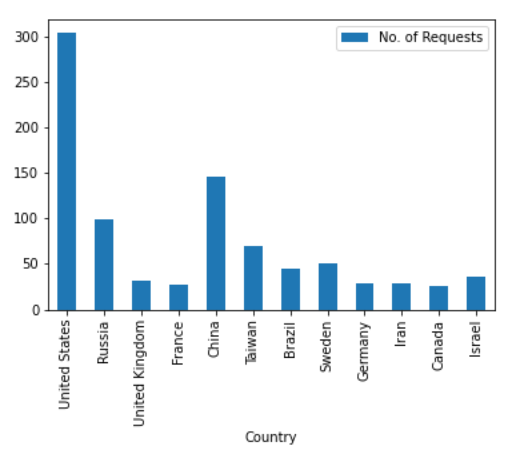
- Bar graphs on the same data set
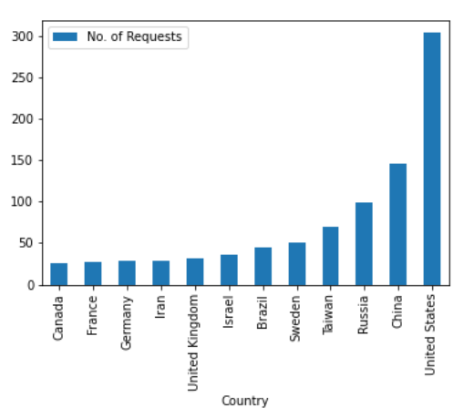
- Bar graph on sorted data
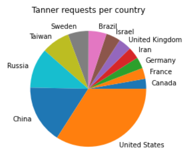
- Pie chart on country vs number of requests
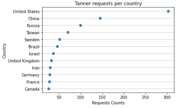
- Scattered graphs
Sorted data set
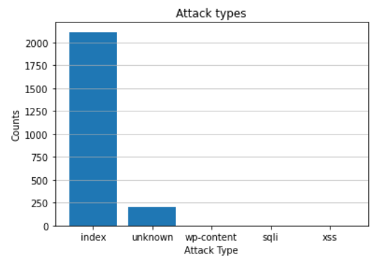
- Types of attack
That’s all, I think I learned a few new things today. oh and one of the cool things that I learned today was how to include gist in your blog posts. If you are using Jekyll for your blog then check out jekyll-gist. This plugin helps you embed gist in your GitHub pages easily.
Thanks for reading and if you have any suggestions about the code or anything else then let me know.